Responsive Redesign
My goal in this project was to practice the workflow of redesigning a simple website. This involved identifying and analyzing the flaws of a pre-existing website, creating low-fidelity and high-fidelity prototypes for an alternate design, then coding a responsive website based on the prototypes.
Choosing the Website
Since most large companies have teams of UI/UX designers working on their user interfaces to create the most seamless experience, I chose to analyze the flaws of a website for a small local museum.
Identifying Usability Problems
Finding Problems
- Design issues that I address include:
-
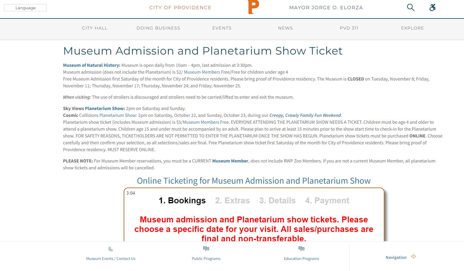
The lack of visual hierarchy harms the efficiency of the website.
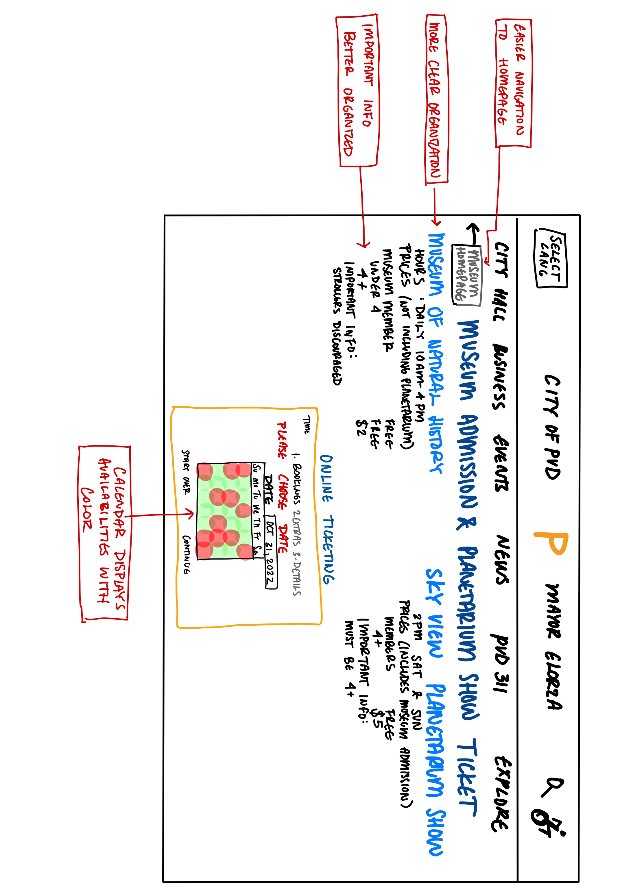
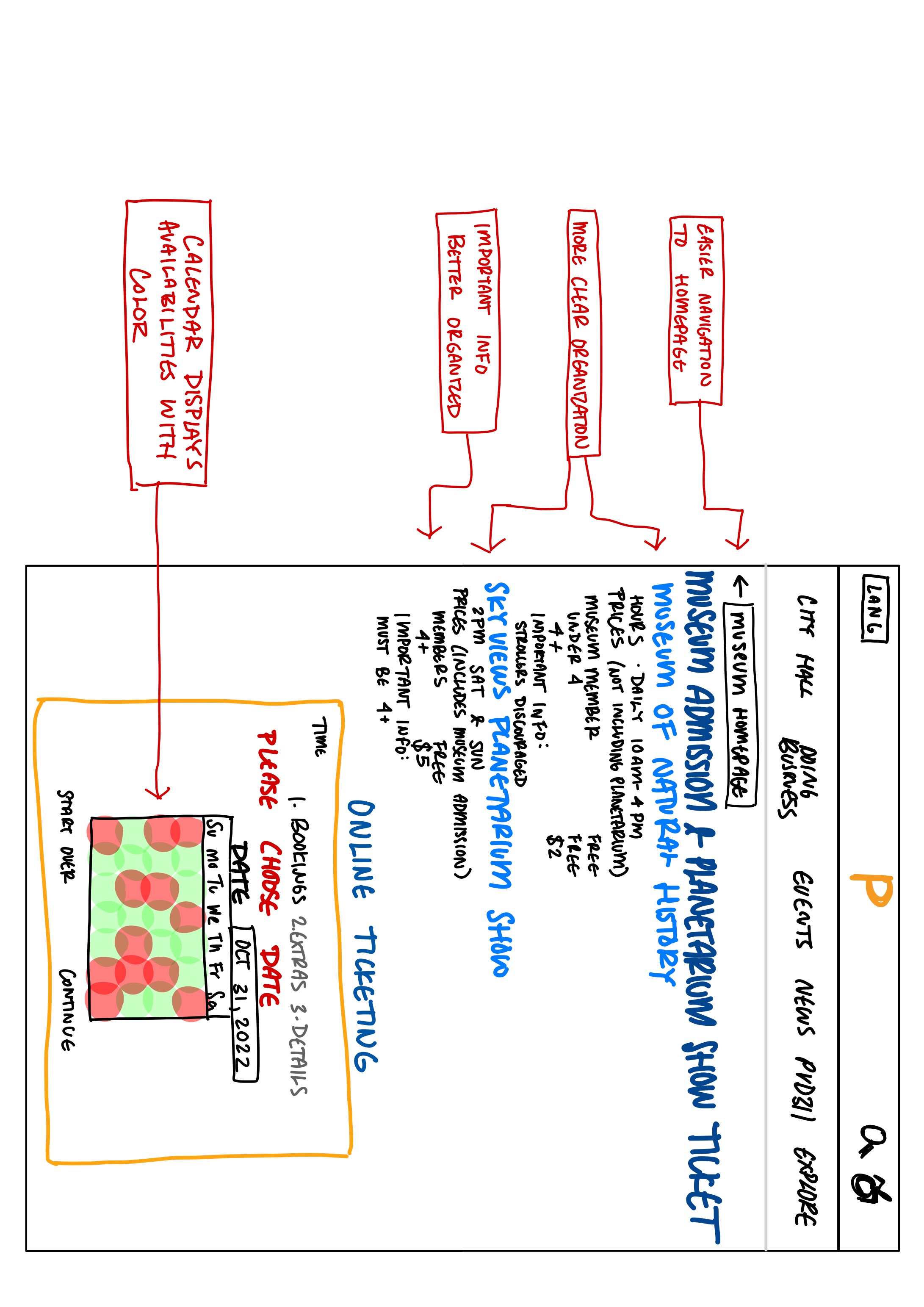
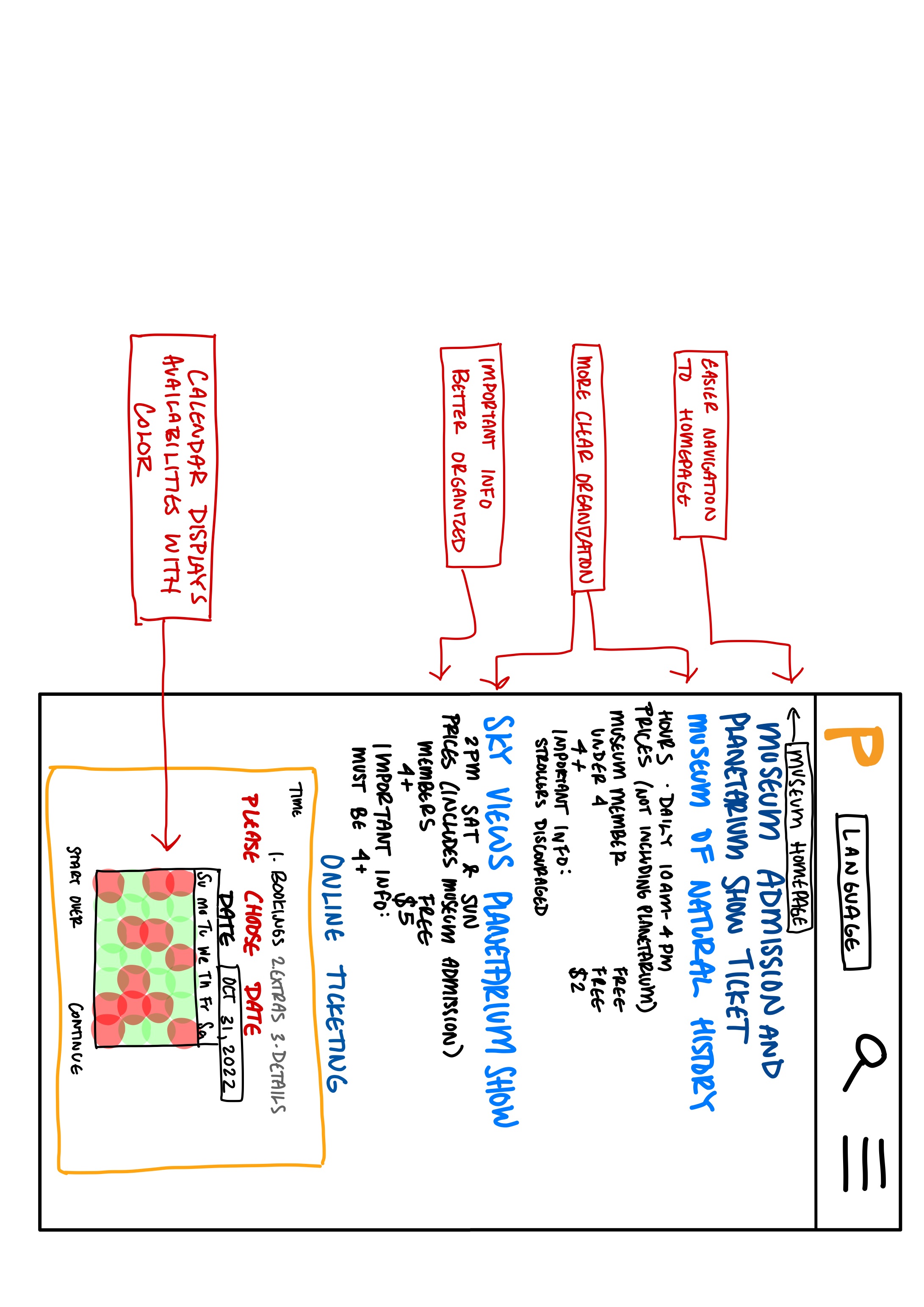
This makes finding specific information such as museum hours or ticket pricing more difficult to find since the user must scan the large block of text. - There is no immediately obvious way to navigate back to the museum homepage if the user would like to review information about events or exhibits.
- When choosing a date to visit the museum, the calendar date picker does not display the museum availabilities. Allowing the user to see which dates they are able to come visit saves them the hassle of choosing a date only to find that the museum is closed or fullly booked.
Accessibility (Investigated using WebAIM WAVE)
- Wave identified 2 errors with the page including:
- Lack of alternate text for an image
- Lack of alternate text for a form
- WAVE also identified 15 alerts including:
- Small text
- Large block of justified content (creates potentially confusing or hard to read white spaces)
- Unlabeled form control
- Redundant links
- Not clearly labeled links
- Possible headings (that are not given proper highlighting)
Visual Redesign
Annotated Wireframes
Click to enlarge
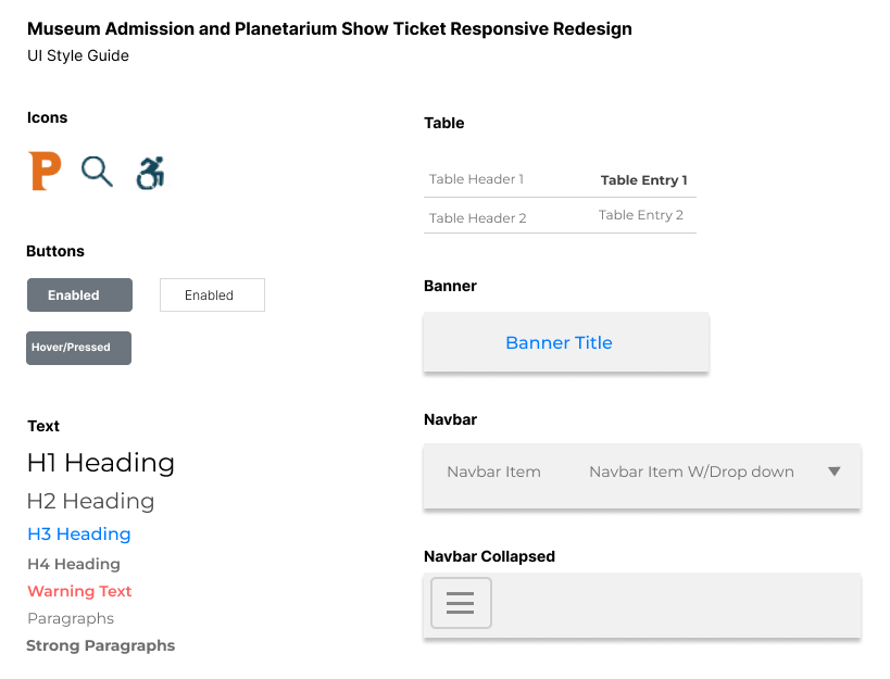
Visual Design Style Guide
High-Fidelity Prototyping
Note: If the Figma does not load propery, try refreshing the page.
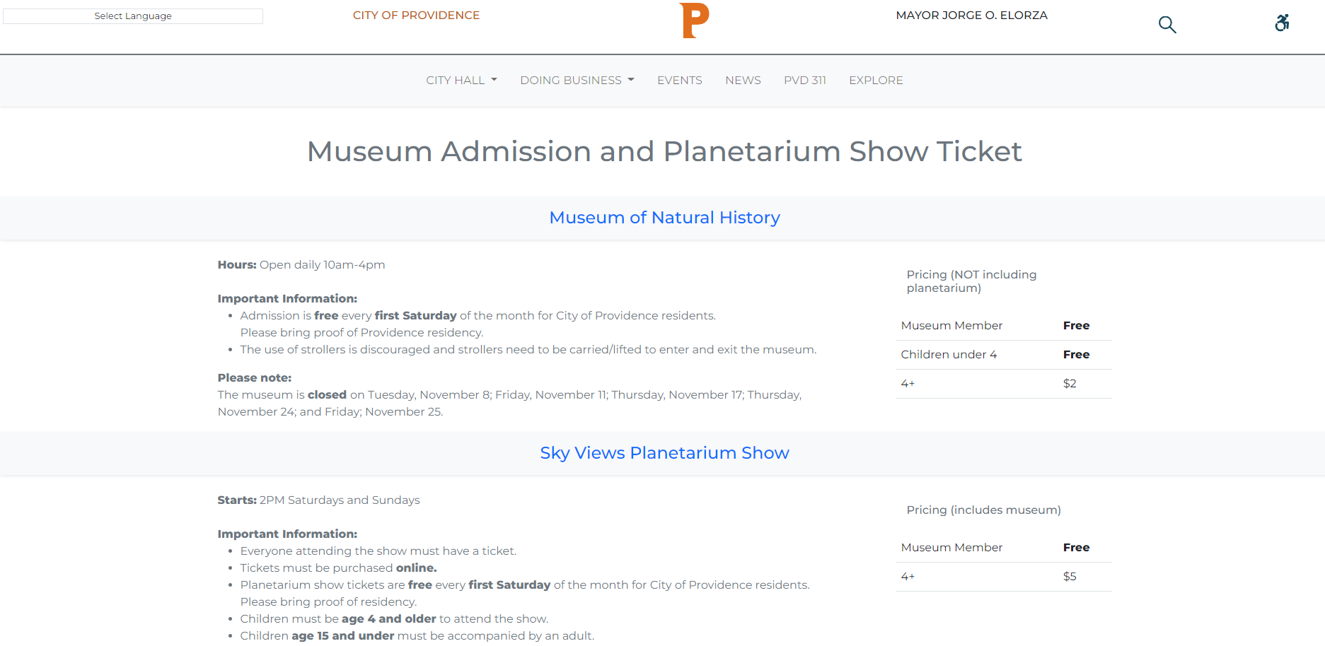
Responsive Redesign
I used the CSS framework Bootstrap to easily create a responsive website based on my high-fidelity prototype.
Takeaways
- Thought critically about the design choices of a real website
- Used hierarchy principles to better present information
- Used Figma to create a visual design style guide and high-fidelity prototypes
- Thought about the user experience for various screen sizes
- Learned how to accommodate for various screen sizes using Bootstrap